|
Olympus Picture Modes Revisited (with samples from the E-M1 II) |
|
|
My other articles related to the |
|
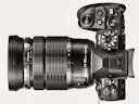
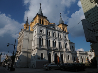
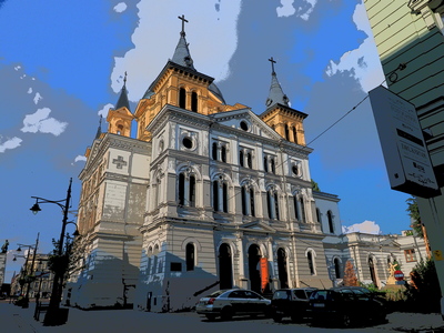
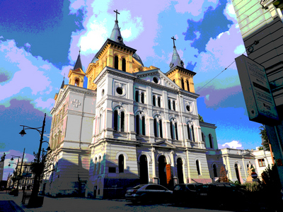
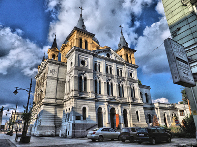
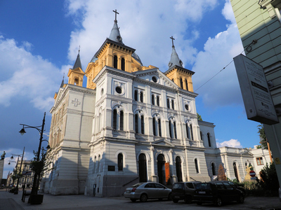
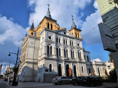
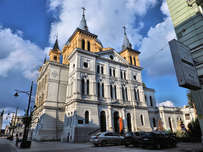
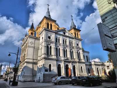
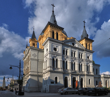
The introduction to Picture Modes as used in Olympus cameras can be found in a separate In addition to Picture Modes, I will be showing the effect of tonal curve adjustment, which is a more recent addition to the Olympus JPEG engine, as well as some special effects, related to the subject. Let's go straight to image samples. They are all based on one frame, acquired during my recent trip to Poland; this is a church in my original hometown of Łódź. Shot with Olympus E-M1 Mk. II, MZD 12-100/4.0 Pro lens at 12 mm. Aperture Priority, 1/2000 s at F/8.0, ISO 400, 5300K. The thumbnails link to RGB-converted images, otherwise unmodified (other than being downsampled to screen size (1440×1080). As Picture Modes are applied during the raw-to-RGB conversion, all I needed was a single raw file, from which I could later generate all mode JPEGs I need. The results are identical to those produced in-camera. Oh, yes: the pictures. Some (maybe most) of the effects discussed here are barely, if at all, noticeable in side-by-side viewing or sequential browsing. While I am not an HTML, CSS, or JavaScript wizard, still, I'm semi-literate in these areas, so I wrote a small, Web-based Image Flipper, designed specifically to allow the viewer to catch even subtle differences between various versions of the same image. The Flipper allows you to browse a set of images, but also to alternate back and forth between any two. In the current version, clicking on any thumbnail brings up the Flipper showing a full-screen (or close) version of the same image. Then, without returning here, you can use the keys and screen buttons to move between images. Pressing [H] displays a list of available options; just remember to hit the darned [F11] key to enter the full-screen mode (if your browser supports it), and enjoy. Unfortunately, Explorer, Edge, and Firefox seem to ignore any requests to preload all images, which results in a transition flicker. I find this quite annoying but can't find a work-around. Muted, Natural, Vivid These are the three basic Olympus Picture Modes. Each can be additionally adjusted in terms of contrast, saturation, sharpening and gradation. The last parameter allows you to choose one of four predefined tonal curve types); that is set to Normal in all three samples shown here. |
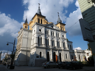
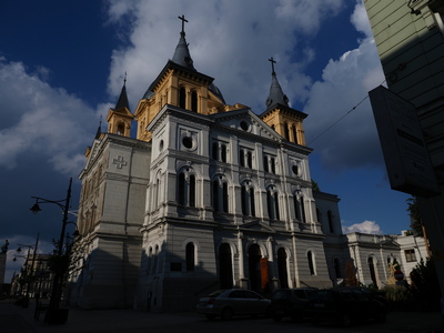
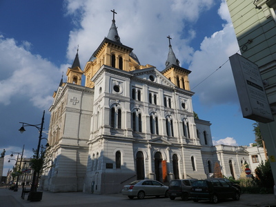
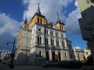
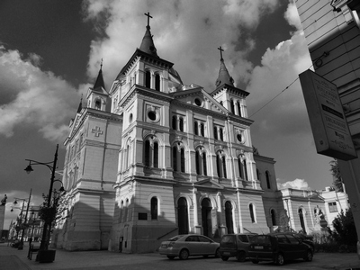
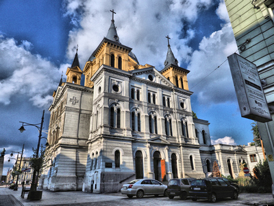
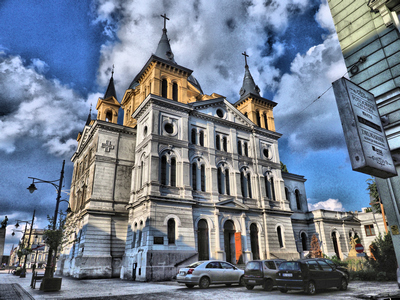
[1A] Muted |
[1B] Natural |
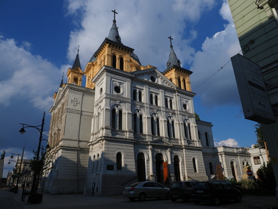
[1C] Vivid |
|
The results are as expected and not overdone.
Contrast and saturation, again, can be easily adjusted even in JPEG postprocessing. Sharpening is outside the scope of this discussion; things are getting less trivial when we get to gradation. This will be demonstrated in the next row of samples. Anyway, the basic modes will be of interest only to those who do not postprocess their JPEGs. For those who do, the Natural mode is all they will ever need. Gradation This can be set to one of four enumerations as shown below (the fourth one, Normal [1B], is above). |
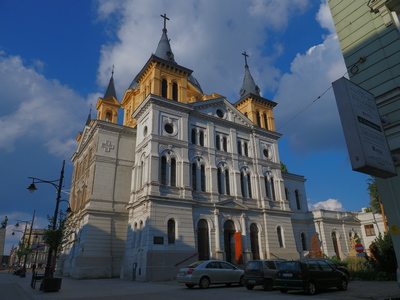
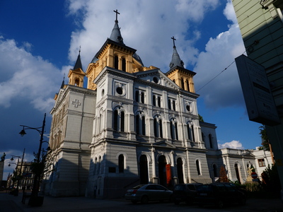
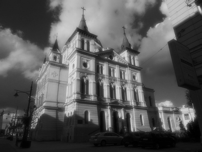
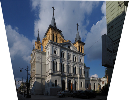
[2A] Natural PM, High Key gradation |
[2B] Natural PM, Low Key gradation |
[2C] Natural PM, Auto gradation |
|
I am a bit disappointed with the Low Key and High Key gradation settings; what they seem to do is moving up or down the central part of the tonal curve; that's not enough to call it a High/Low key technique. Trivial.
The Auto option is more interesting. It moves shadows up, therefore stretching that region and showing better detail there. This happens at the cost of narrowing the remaining part and reducing the curve slope there; read: reducing mid- and high-tone contrast. (Don't worry, there is usually plenty of that.) The third sample above shows this quite well. The shadows have been opened quite dramatically, thank you (see the cars). Click on the thumbnail for a larger version and note that the highlights (window openings) did not go down, but are not blown out, either. Compare that with the Normal gradation of the Natural mode [1B]; a nice job. As opposed to other adjustments, discussed above, this one is better done on a raw image file, not on the RGB (JPEG) one. The reason is that the latter uses only 8 bits (256 distinct values) for each primary color. Out of that, just a fraction (say, 32 or 64 values) belong to the region stretched, and stretching results must be rounded to the nearest available level — yes, we are getting posterization (here often called pixelization). Very annoying; happened to me more than once when, not having a raw file, I had to work with a JPEG. If this is done on raw pixel/photosite data, we have 12 bits (4,096 levels) per color: less granularity, less posterization. Actually, Olympus never mentions how many bits per color their recent cameras use in the raw data. It used to be 12; I'm just assuming this did not change. The i-Enhance Mode What Olympus did here was to invent a new word and use it for a new camera feature without defining what it means, or what the new feature really does. All the manual says is that it "produces more impressive-looking results suited to the scene." Oh, wait, not quite. There is one more priceless piece of information; this time a real nitty-gritty, something for advanced users:
Their tech-pubs department keeps impressing me again and again. These guys never fail. Anyway, within this mode just one parameter can be adjusted: the Effect. to choose between three effect strengths. |
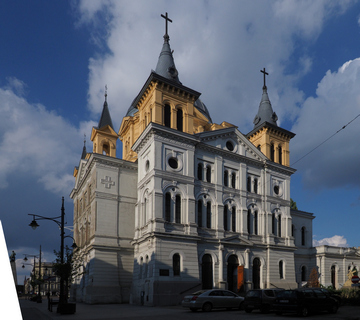
[3A] i-Enhance Low |

[3B] i-Enhance Standard |

[3C] i-Enhance High |
|
The i-Enhance Picture Mode does not seem to do much, if anything, beyond slightly increasing contrast and saturation — just compare these three images with the next row. Obviously, the increase in contrast comes at the expense of shadow detail and/or burnt-out highlights.
The results are sometimes quite nice (like this time), but sometimes — quite hideous. My advice would be to save the original ORF file as well, just in case the mode does not work well for a given scene. Still, my impression is that in the later camera models this mode has been tweaked so it becomes usable more often. Or you may just forget about the whole affair: adjustments of this magnitude can be easily applied to a JPEG file in postprocessing. Tonal curve adjustment Now, on top of all that, Olympus added yet another tonality adjustment, or rather a triplet of adjustments: Highlights/Midtones/Shadows (HMS). Parts of the tonal curve are dragged up or down by these three points, with each displacement being from -7 to +7 in some arbitrary units. Obviously, HMS should be a part of the Picture Mode, but it isn't. Yet. This is, however a different story. Let's now see the effect of HMS on JPEG images as converted by Olympus Viewer. |
[4A] My Sunset preset: H-6 M-2 S+4 Auto |

[4B] My Sunny preset: H-3 M-2 S+3 Auto |
[4C] My HiNoon preset: H+3 M-2 S-3 Normal |
| A preset developed for my Sunset Panoramas project, to open the foreground shadows. It did good there, but I think it is too strong for this scene. | This is the scaled-back version, for non-sunset scenes. Better. | The third preset, is the exact opposite of those two. Up-in-your-face contrast and forget the shadows. At this moment just a proof of concept. |
|
Comparing these pictures in the Flipper shows how powerful the HMS ajdjustment may be, especially when it is properly integrated with the other features. Maybe one day.
When using the Olympus Viewer, I can store all such presets in named slots for later use. It wouls de nice to have such an option in the camera, too, even if it were to be defined on a computer and only transfered to the camera. One paltry Custom Picture Mode will not replace that. Well, another reason to do it in postpr ocessing. Monochrome All OM-D cameras have a Monochrome Picture Mode (for many years stubbornly referred to an Monotone, another one of my little crusades). When you select it, you can still adjust the contrast and sharpness. There is also a Filter setting, simulating color filter use with B&W film (Yellow, Orange, Red, or Green). |
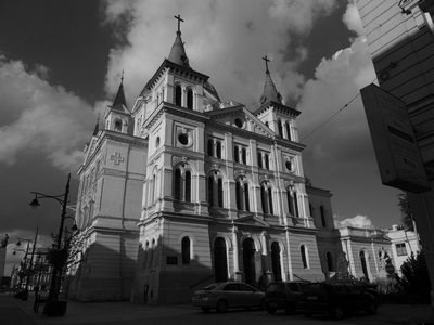
[5A] Monochrome (red filter) |
[5B] From [1B], PSP (red filter) |
[5C] From [1B], PSP (IR effect) |
|
The Monochrome Picture Mode is OK, certainly better than just simple desaturation, but nothing to write back home about. I've used a red filter here (really: just giving Red a higher weight when converting RGB to B&W luminosity). This makes blue sky quite dark.
Every image-processing application offers at least one mono converter; often more. The second image shows off the one in Paint Shop Pro 20, and the third — the faux infrared filter effect in that program. I like and use them both, depending on the subject, and they can be applied to any JPEG image. I like the standard PSP mono converter a lot, but for some scenes the fake IR effect in that application is my favorite, with the misty halo radiating from the highlights (the magnitude of this effect can be adjusted). Thus, again, I'm in favor of monochrome conversion only in postprocessing. Starting from a color JPEG is perfectly OK here, but setting the in-camera option will help you in composing the picture . Bonus: Art Filters and whatever As you may remember, I'm not a big fan of the Olympus Art Filters, and I'm staying put in my trenches on that. Still, from time to time I check them in postprocessing of a selected frame, just to see if I change my mind. Nope. |
[7A] Dramatic Tones I |
[7B] Dramatic Tones II |
[7C] Key Line I |
| Dramatic Tones, both color and monochrome, are not overdone and can be usable as more than just a novelty to try out and never come back to. These two work quite nice for this subject, even if it is safer to assign them in postprocessing. | This is the effect with perhaps the largest percentage of pleasing results, but it is quite intrusive — how many Key Line frames can you have? | |
|
I've tried, just in case, most of the other Art Filters, which turned out to be a waste of time.
For comparison, I also decided to try out some special effects in a third-party image postprocessing application, the PSP 20. Here are three images which just may be worth your attention. |
[8A] Posterization |
[8B] Local Tone Mapping, 60% |
[8C] Glowing Edges |
| The old faithful posterization trick. The results are almost never really bad, but they soon become boring. | This is an interesting technique (not even listed as an 'art effect' in the program interface). Here it was used it at a high setting. The thumbnail may look like that of [8A], but really they are quite different; compare larger formats.. | Actually, this involved three steps: Glowing Edges, conversion to monochrome, and negative inversion. I find the results very pleasing, and some tweaking of the process could only improve them. |
|
Of these, Local Tone Mapping (sometimes referred to as Local Equalization) may deserve some special attention: at lower intensities it can be quite subtle, more of an image adjustment then of a special effect. As this is commonly available in image-processing applications, let's have a closer look.
Here are image samples for six various strengths of this effect. While I did this on the Photo Paint, a number of other applications offer this option; there are also Photoshop plugins for this. |
[9A] No LTM |
[9B] LTM at 5% |
[9C] LTM at 10% |
| The unaffected image for reference: just [1B] after a "one-click fix". | At strengths up to 10%, perhaps a bit higher (depending on the scene), LTM works nicely expanding the contrast in areas it is needed. | |
[9D] LTM at 20% |
[9E] LTM at 50% |
[9F] LTM at 99% |
| At 20%, while not yet disturbing, the effect becomes to hint: "somebody was playing with my picture". | From 40% or so up, depending on the subject, Moon phase, and the Chinese calendar year, the effect is becoming quite heavy. This is no longer an image adjustment, but a special effect; be careful. | |
|
While the thumbnails don't show much, the Flipper
does a good job in exposing even subtle differences.
By the way, for the last year or two I was suspecting that some phone and tablet makers (no names, please!) are using LTM just to enliven the results. I am almost certain now. Extra: Perspective correction For the image to show around (the "gloating exhibit"), I decided to submit the picture to perspective correction, applied during JPEG postprocessing in Paint Shop Pro. Let me share a few brief observations on the basic steps involved. |
[6A] From [1B], Perspective correction |
[6B] Aspect ratio, crop |
[6C] Paste job, tonality, done |
| The first thing done to the original [1B] was fixing the perspective in PSP 20 (almost any image editor has this feature). This came at a price: about 30% of image width was lost, and the aspect ratio became heavily distorted. | After adjusting the aspect ratio, I decided against cropping out the entire missing area: just liked some of small detail there, especially the statue. I just had to fill the white triangle somehow. | Luckily, that area was intact in another frame, shot a few seconds earlier, identically exposed but rejected for other reasons. Pasting that in was easy. The last thing was adjusting the tonality. Tada. |
|
I ended up with a nice postcard picture of a weird aspect ratio: 9:8. I'm still not sure if I should have "fixed" the perspective. The original one was how human eye actually sees things; it is just our brain which "fixes" it and now we often expect those "fixes" from images. Oh, well. I keep both versions.
Why didn't I use the Keystone Compensation option in the camera? I doubted it would be precise enough, using the finder or monitor. I may be wrong on that; if so, I will revisit the issue. |
|
|
My other articles related to the |
| This page is not sponsored or endorsed by Olympus (or anyone else) and presents solely the views of the author. |
| Home: wrotniak.net | Search this site | Change font size |
| Posted 2017/10/25, last updated 2018/01/21 | Copyright © 2017-2018 by J. Andrzej Wrotniak |