
|
Picture Modes in Olympus E-510 (and E-410) |
|
|
My other articles related to the |
|
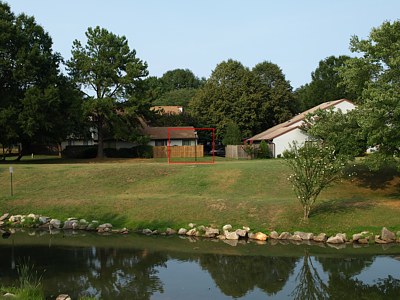
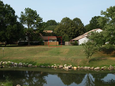
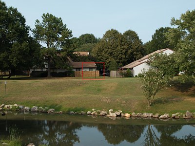
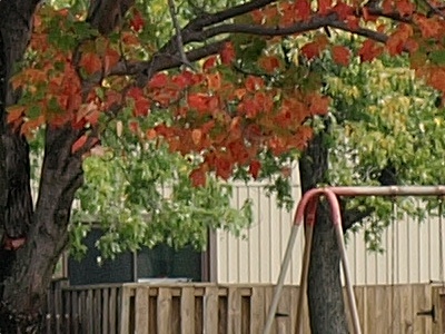
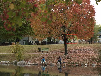
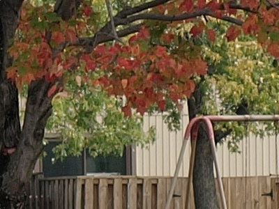
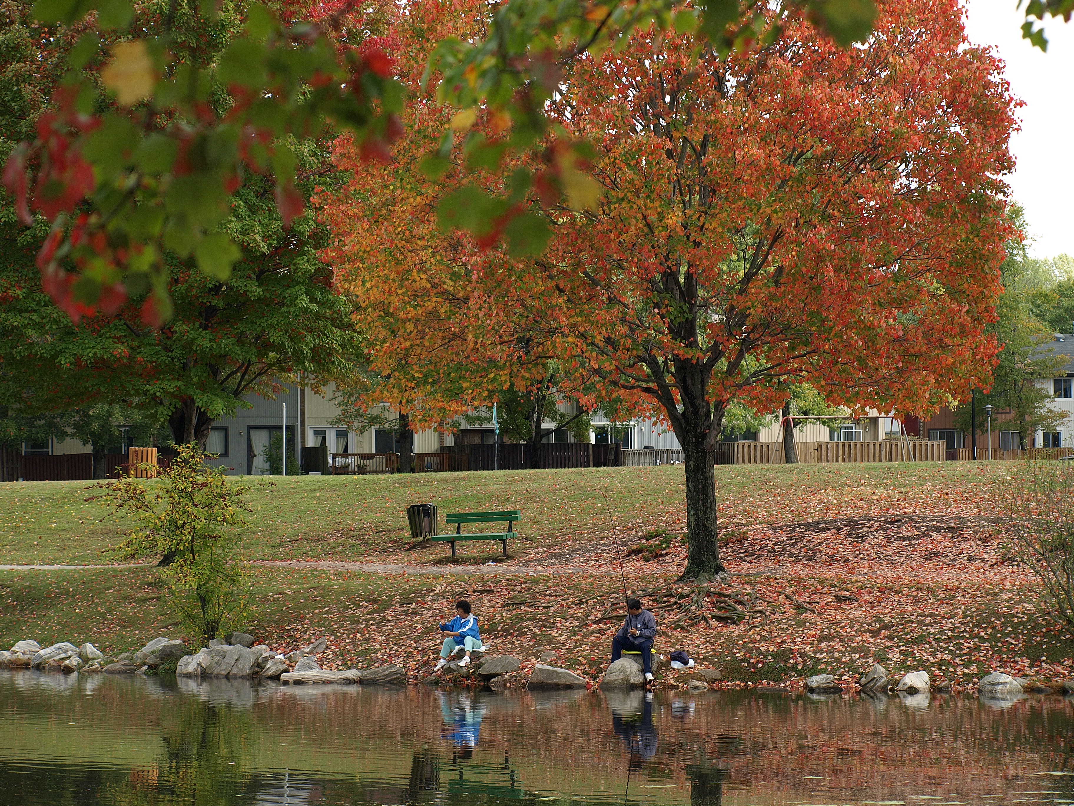
The Olympus E-510 and E-410 digital cameras allow the photographer to switch quickly between three "Picture Modes" — pre-packaged sets of parameters, determining how the raw sensor data is translated into the RGB image. These modes, referred to as Vivid, Natural, and Muted, define the contrast, sharpness (more exactly: sharpening performed in the conversion process), and color saturation. Each preset has a default combination of these three, more or less reflecting the preset name, and on top of this the parameters can be further adjusted to your liking; the adjustments are stored so that they are recalled every time the given Picture Mode is used. There is a fourth parameter, called Gradation, which is best left alone at Normal in general shooting; if you are interested, feel free to experiment with it, but I've decided to leave it alone in this article. There is also a fourth Picture Mode, to which Olympus stubbornly keeps referring as Monotone, but which really is monochrome. (Ironic: a poor, ignorant immigrant like myself fighting for the purity of a language he barely knows!) This is a separate subject, out of scope of this write-up. The Picture Modes can be approached as different kinds of slide film you could load into your camera ten years ago: each produces images with a certain character. They do not affect the raw (.ORF) files; if you are using that format, the presets will be applied (and can still be changed) only in the process of raw-to-RGB conversion on your computer (if your conversion software supports this feature). A more detailed discussion of Picture Mode settings can be found in another article; here I'm just going to show a few examples and offer some remarks. Each subject was shot three times, once in each of the Picture Modes. These modes were adjusted as per my recommendations in the that article (adjustment values shown in captions). Images on the left are full frames, reduced in size and re-sharpened; those on the right are 1:1 pixel scale fragments without any postprocessing. The camera used was the E-510; the results are fully applicable to the E-410 as well, as both cameras have the same sensor and identical image processing engines. Ready to have a look? Let me start from a subject I'm very familiar with; lakeside houses in my neighborhood, shot in a somewhat diffused sunlight. |
|
| |
|
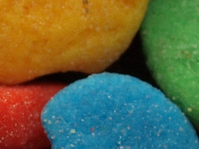
Vivid, all adjustments at 0 In absolute terms: Sharpness 0, Contrast 0, Saturation +1 (all on a -5..+5 scale) | ||
|

| |
|
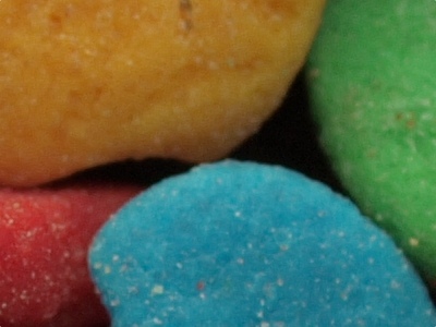
Natural, all adjustments at 0 In absolute terms: Sharpness -1, Contrast -0, Saturation 0 (all on a -5..+5 scale) | ||
|

| |
|
Muted, all adjustments at 0 In absolute terms: Sharpness -2, Contrast -1, Saturation 0 (all on a -5..+5 scale) All three pictures above: E-510, 14-42 mm F/3.5-5.6 ZD lens at 25 mm, aperture priority (-.3 EV): 1/320 s at F/5.6, ISO 100, WB at 5300°K (sunny). Tripod, remote. | ||
|
Differences, although more subtle than before, are quite visible. Note how the grass changes towards yellow from Natural to Muted! Now I'm going to throw a splash of pink into this quiet neighborhood: |
|
| |
|
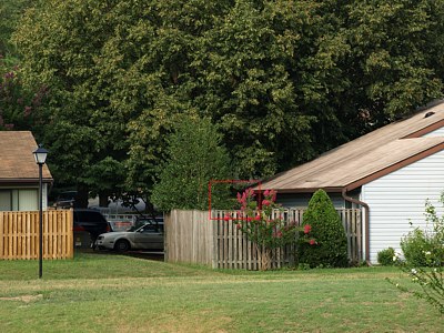
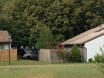
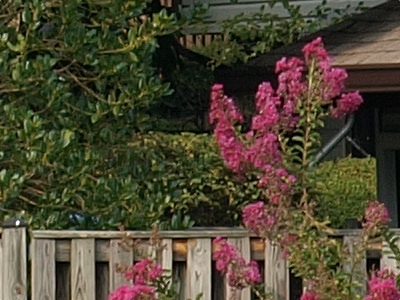
Vivid, all adjustments at 0 In absolute terms: Sharpness 0, Contrast 0, Saturation +1 (all on a -5..+5 scale) | ||

|
| |
|
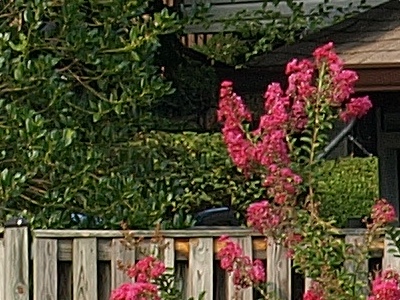
Natural, all adjustments at 0 In absolute terms: Sharpness -1, Contrast -0, Saturation 0 (all on a -5..+5 scale) | ||
|
| |
|
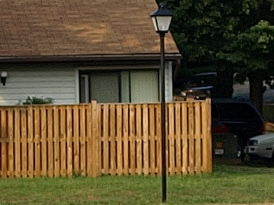
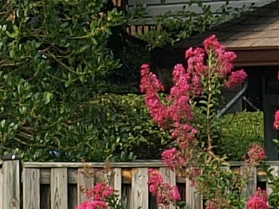
Muted, all adjustments at 0 In absolute terms: Sharpness -2, Contrast -1, Saturation 0 (all on a -5..+5 scale) All three pictures above: E-510, 40-150 mm F/4.0-5.6 ZD lens at 98 mm, aperture priority (-.7 EV): 1/100 s at F/8, ISO 100, WB at 5300°K (sunny). Tripod, remote. | ||
|
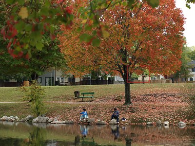
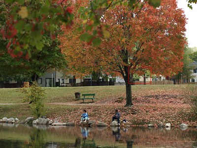
All right, same story, except that pink reacts more visibly to mode change. Also note the effect of contrast and sharpening on fence detail. (Still, I prefer to keep these parameters down, applying sharpening as needed in postprocessing, and moving the mid-tones down instead of increasing the contrast in many pictures.) One more example, this time bright autumn colors under a partly cloudy sky.
| |||||||||||||||||||||||||||||||||||||||||||||||||||||||||||||||