|
Olympus Art Filters, Part 1 A Case Study: Tabletop |
|
|
My other articles related to the |
|
In the past I was often critical of the attention and exposure Olympus was giving in their more advanced cameras to trinkets like "art filters", "picture stories" and similar. I still am.
Not that I am against image filters per se — it is rather against treating them as equals: merging into camera's controls in a way obstructing and cluttering access to the more basic features. Imagine a car maker, who puts a Call Home function between Park and Reverse stick positions, just because the car has an integrated phone system. Need I say more? Besides, such filters are (usually, at least) applied to the image only after it has been converted to RGB, therefore they can be better used in postprocessing, where the user will have more control over the process and its results. We could argue about making an exception for filters emulating film choice (but nothing more radical), with the results relatively dependable and predictable — but not for Early Morning Sunrays! Maybe, to simplify the workflow, in entry-level cameras, but not in models aimed at an advanced amateur! And, still, please don't put them between Park and Reverse (or in the same sequence as , Natural, and Monochrome). Olympus made a move in the right direction in the E-M1, allowing for all Art Filters to be removed (with some effort) from the user interface, except for a dedicated position on the Mode Dial, used to make them accessible from a separate interface screen (which looks like brought over from a totally different camera). Sadly, in Mark I the first filter cannot be removed from the list; an obvious bug since day one. A separate, front dial in Pen F is even better: filters are a feature orthogonal to exposure modes, therefore they should not be competing with those on an exclusive basis. How I set the exposure is a choice totally independent of the filter, if any, applied to the exposed image. Some camera reviewers (no names, please) sing hymns about how great Olympus Art Filters are, so I wanted to check that out. Last time I looked at that was eight years ago, when in the E-620 review I wrote: "This is the most useless feature I've ever seen on an Olympus camera. The effects are non-adjustable and quite crude, and advertising them as a feature differentiating the E-620 (plus some other Olympus models) from the competition just offends my intelligence." So, how did things change since then? I did have a pretext to check that out. For some reasons (too long a story to tell) I needed a series of screen wallpapers, all similar yet not identical, abstract, non-distracting, and, above all, quick to make. The first idea was to take a few out-of-focus shots of a suitable tabletop scene, submitting the results to some image filters in postprocessing. Then I remembered the Olympus Art Filters and chose to merge both projects.
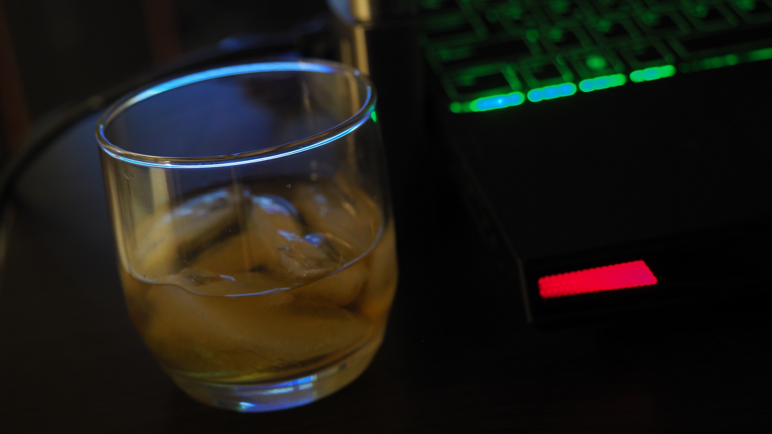
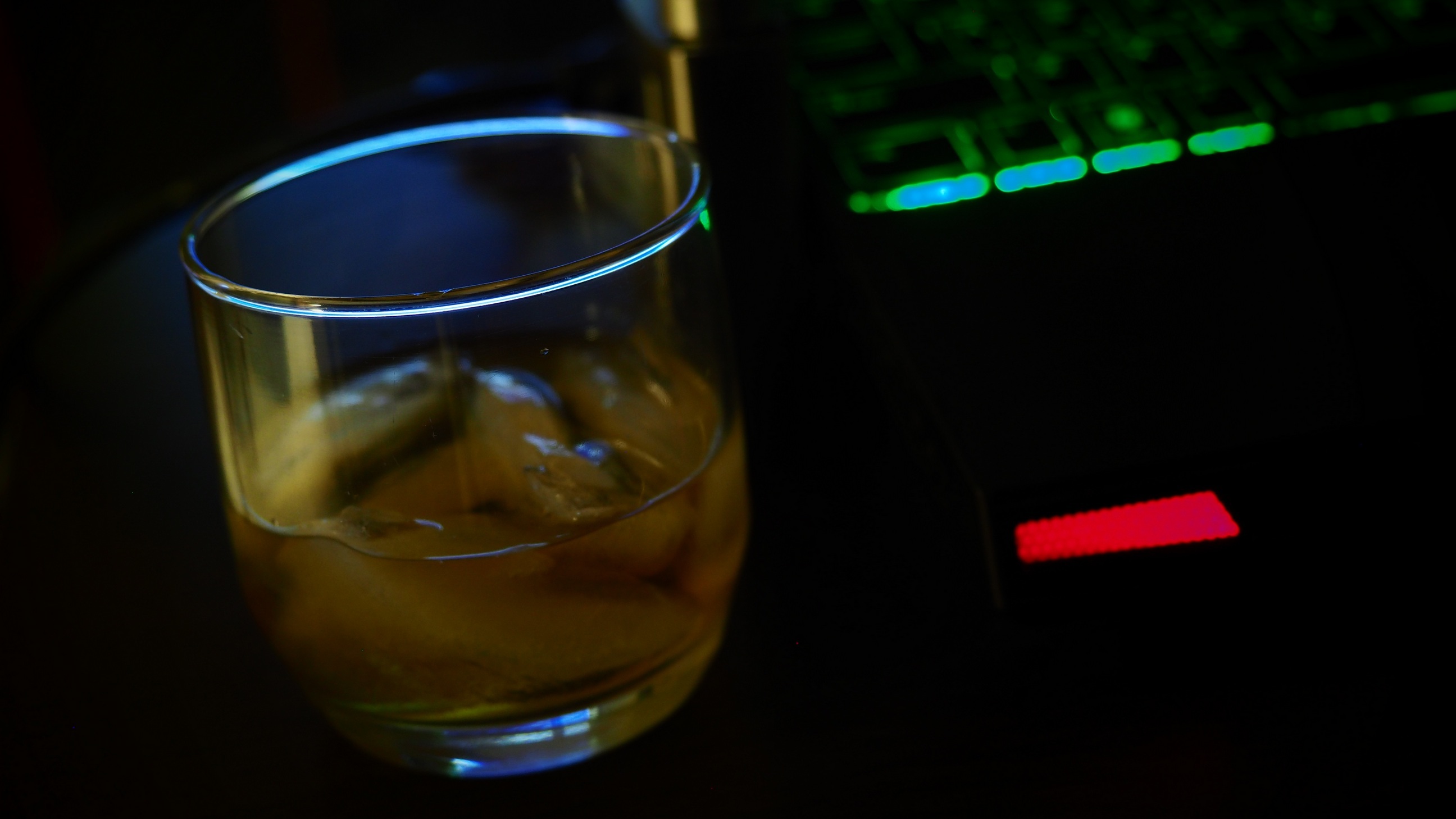
Without thinking much (or even getting up from my chair) I reached for the camera, turned the mode dial to Art Filters, turned Art Bracketing on, and took a picture of whatever was in front of me: my laptop and a shot of bourbon. Handheld, defocused all the way out.
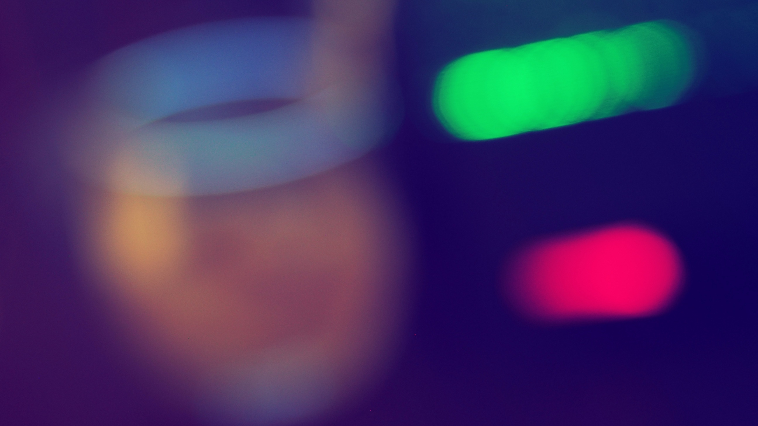
| Here is one of the fifteen images (Dramatic Tone) from this frame. It was postprocessed a bit in PSP X9 by adding some blur, in order to hide strong noise. Clicking on the image shown brings up a larger version: 50% of the original size, or 2592 pixels across. Remember to hit [F11] to enter full screen; this (after a recent Edge update) works on all Windows browsers.
| .ws.jpg)
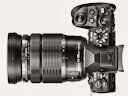
Olympus E-M1 Mk.II, MZD 12-40/2.8 at 25 mm
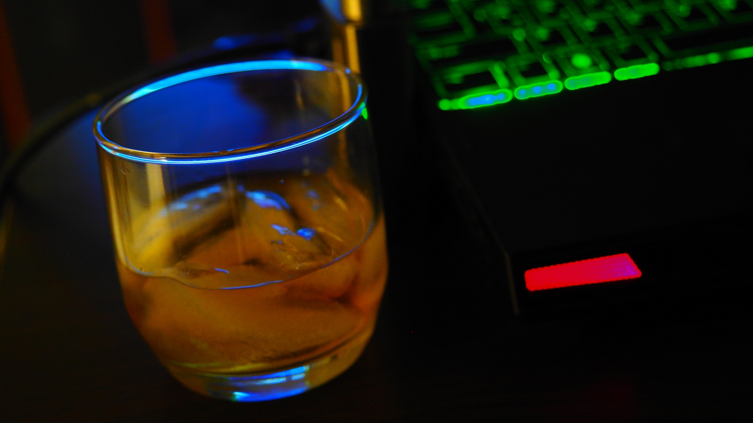
| Encouraged by these first results, I was ready to do a full project, consisting of two parts: one without, and one with defocusing. The first part was aimed at learning more about the Olympus Art Filters, while the second — mostly at generating wallpapers I needed. The Bourbon Project: In-Focus For the real project I did the dishes in the dishwasher, so that the glass does not suffer from any drying streaks. I also used a tripod this time, to assure that both frames are shot from exactly the same position. On the camera side, I've set ISO manually to 400 (the Art mode sets it to Auto) and exposure compensation — to -1 EV, as most of the frame is in deep shadows, not dark enough in the first trial shot. This tabletop scene was arranged with minimum effort: right at the corner of a computer stand, which I'm using when working on my laptop connected to a large-screen TV. The room was rather dim, no special lighting arranged for the shooting. Obviously, I had to use a tripod. Here are the results, exactly as they came out from the camera (except for resizing and cropping). Obviously, some could have been made more presentable by some tonal adjustment, but here we compare just the effects of Olympus Art Filters, unaffected by anything else. The camera was in the Art mode, and I generated all effects from one frame shot, using the Art Bracketing feature (which is not bracketing at all and which I still dislike). Remember: these pictures look much better full-screen. | ||
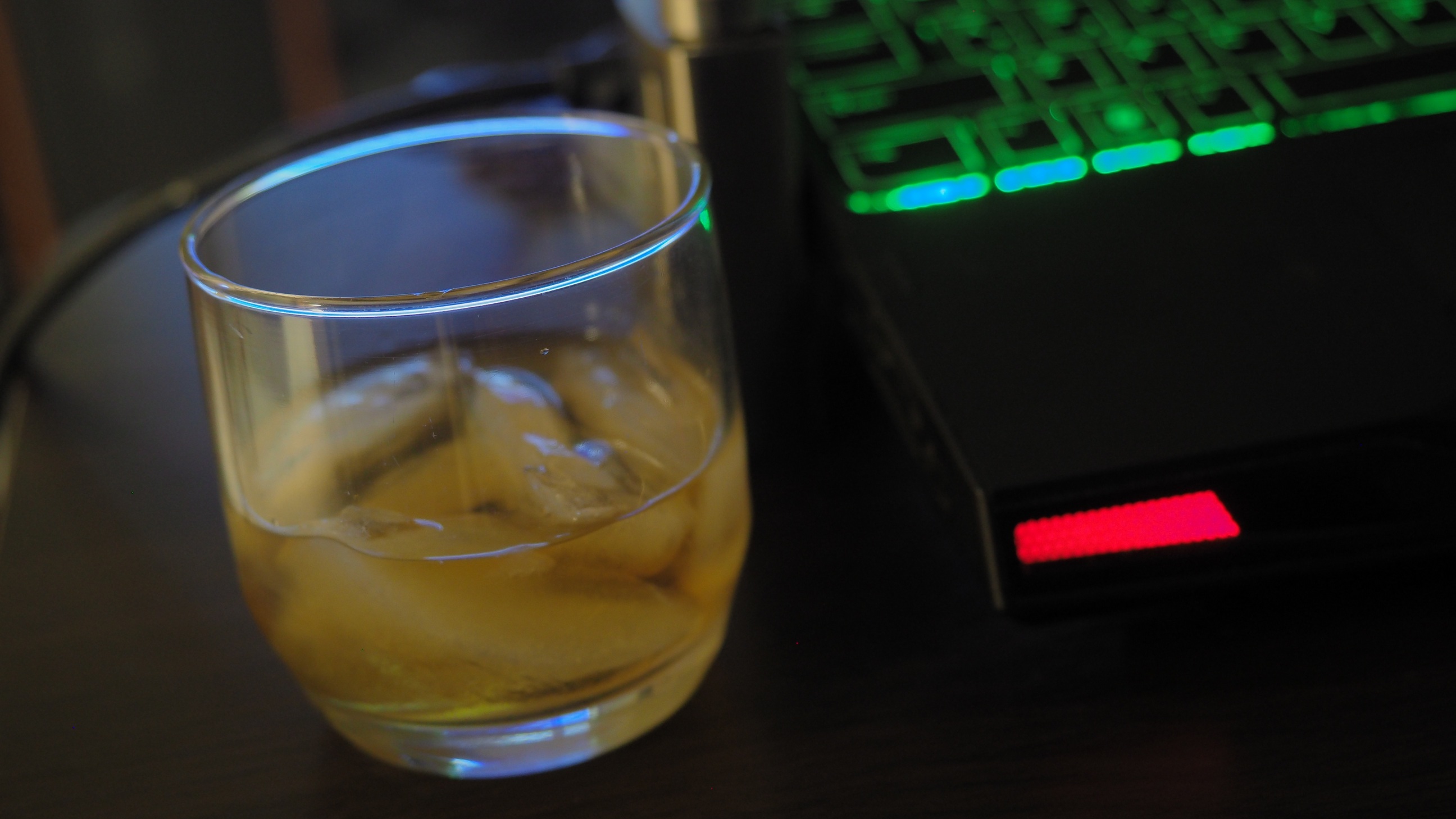
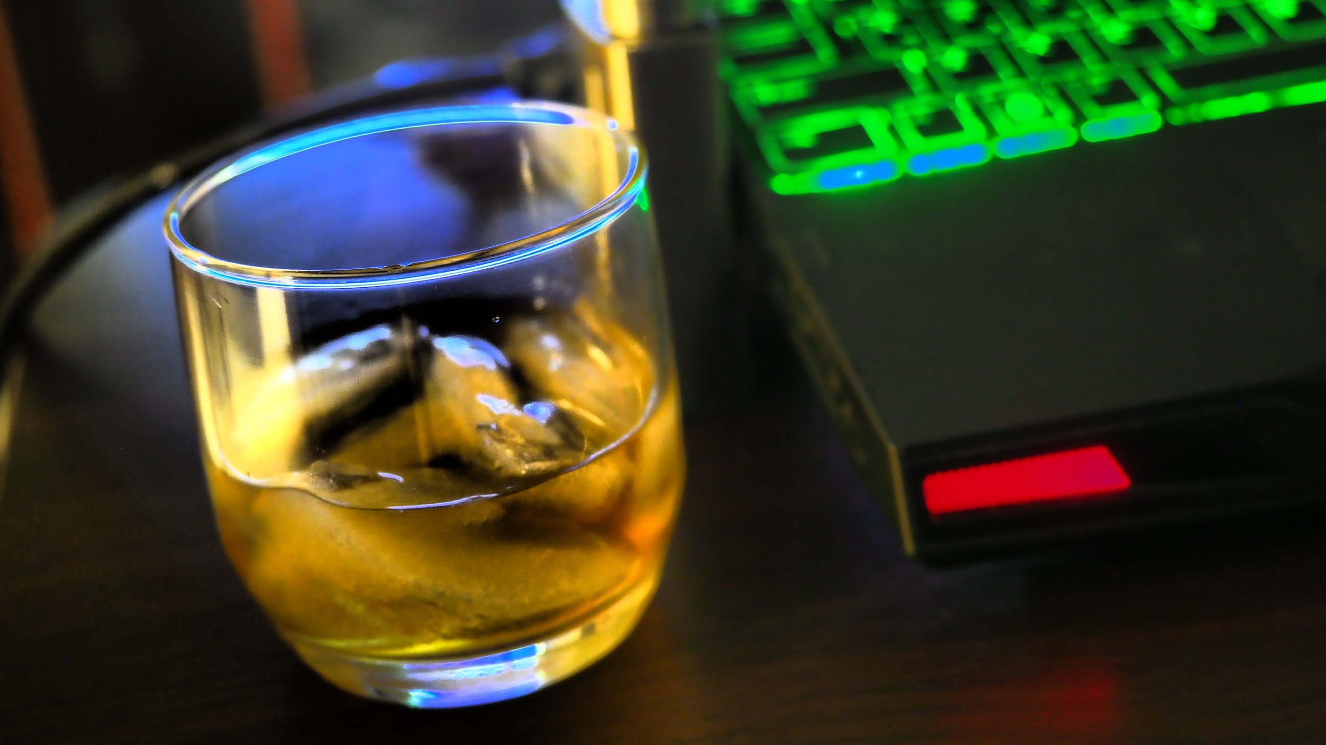
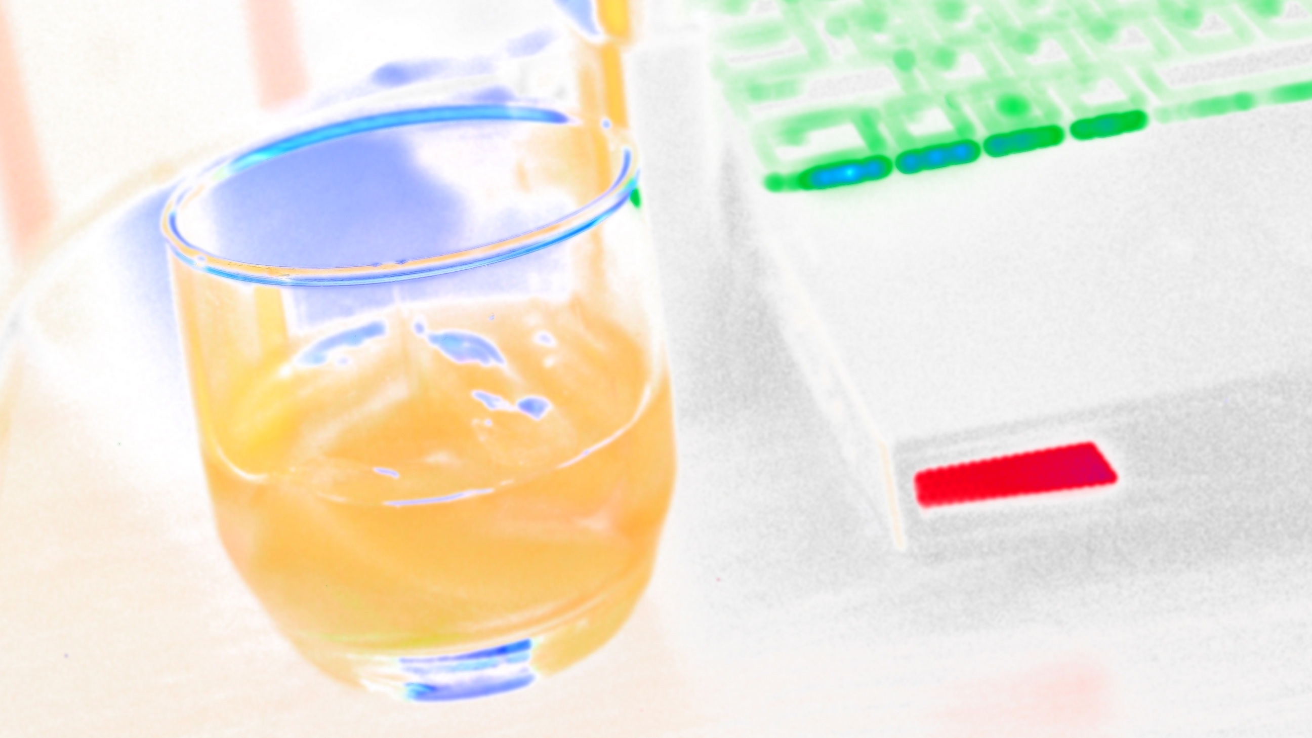
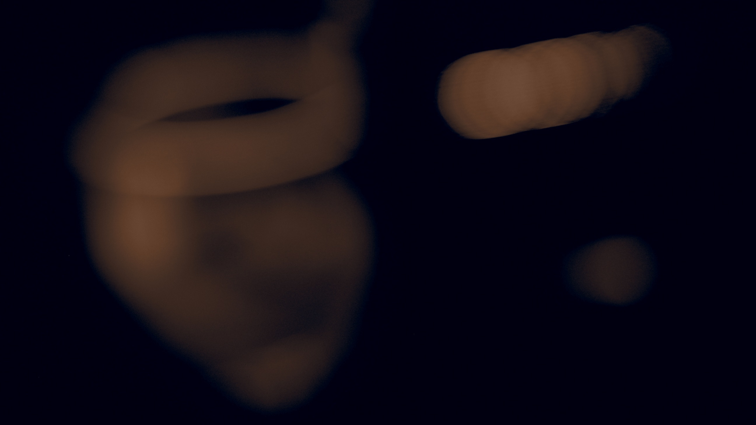
#1: No Effect, Natural Picture Mode
|
E-M1 Mk.II with MZD 12-40/2.8 Pro @26 mm
Program, matrix (-1.0 EV): 1/5 s at F/2.8, ISO 400
You may also use the
Flipper
to browse and compare images, without having to return to the thumbnails.
|
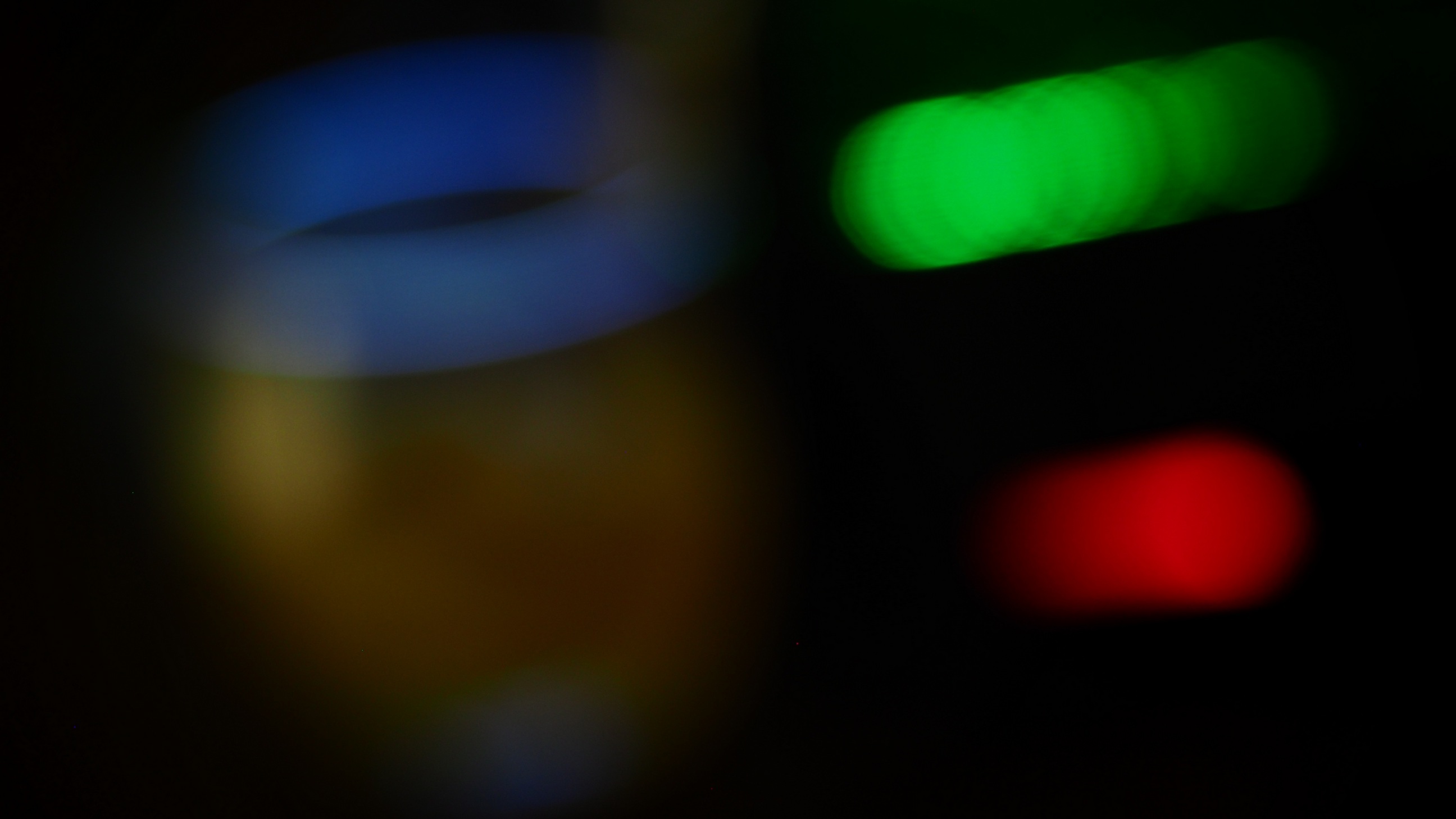
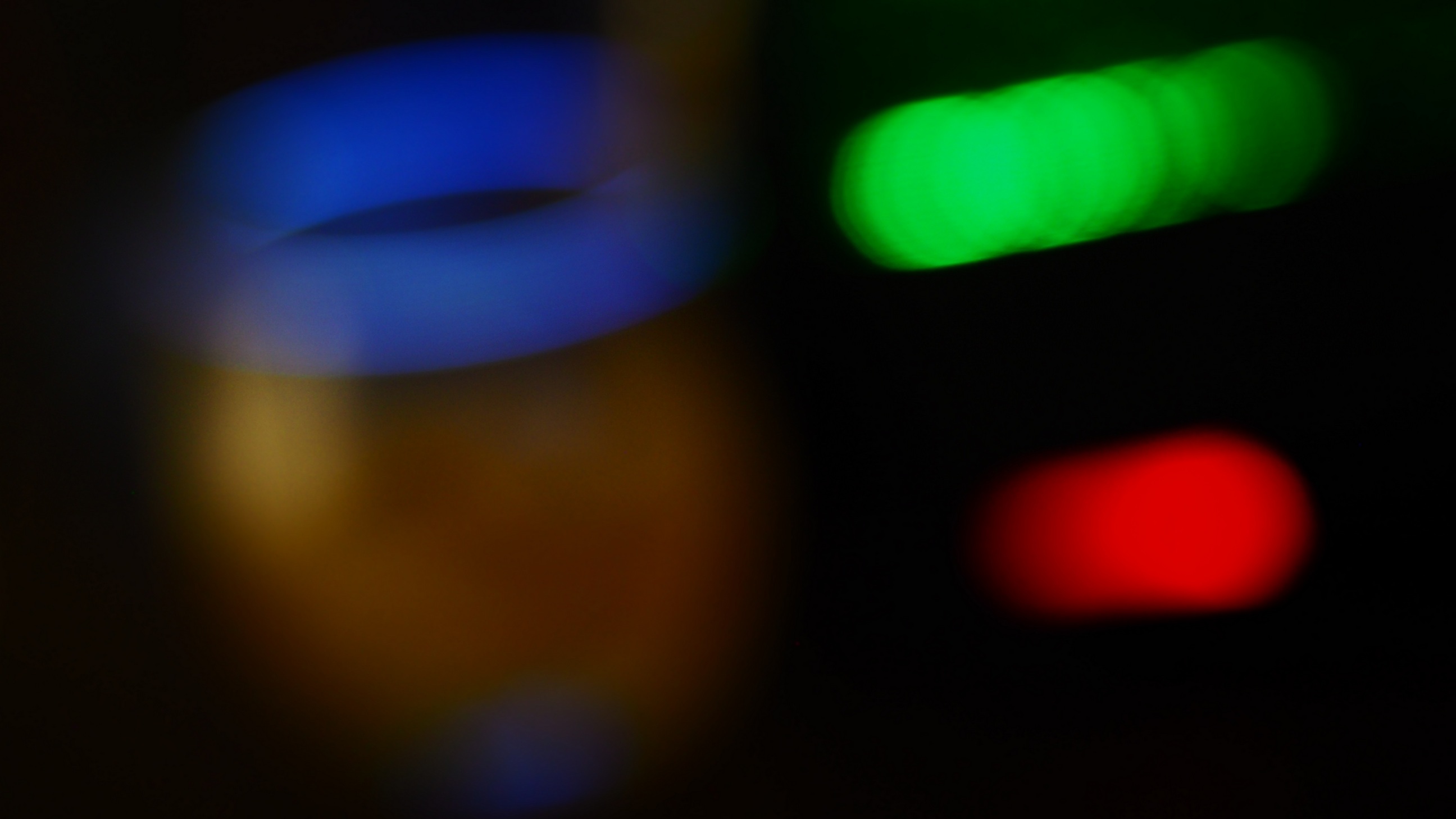
#2: Pop Art
|
#3: Soft Focus
|
#4: Pale & Light Color
|
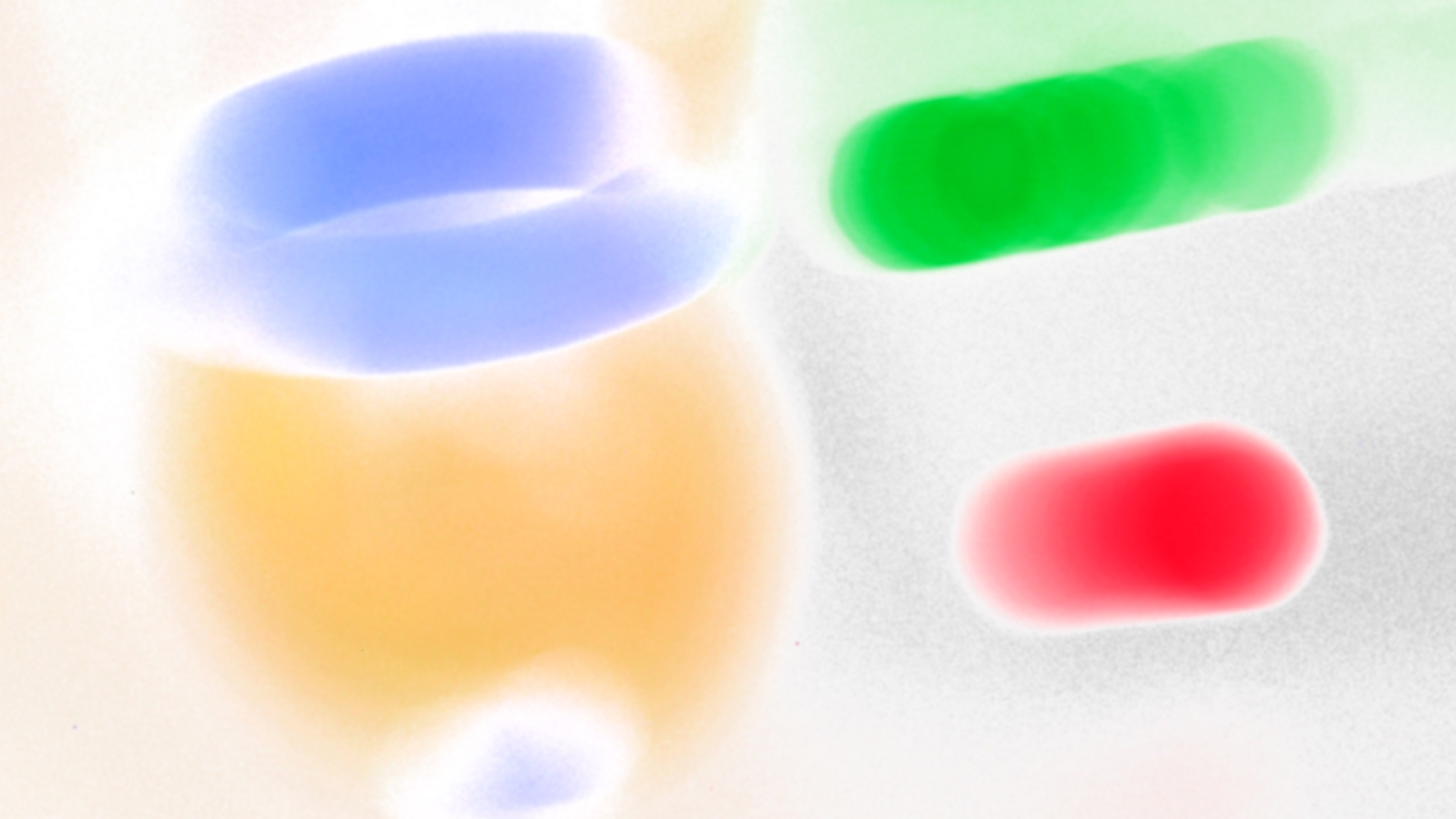
#5: Light Tone
|
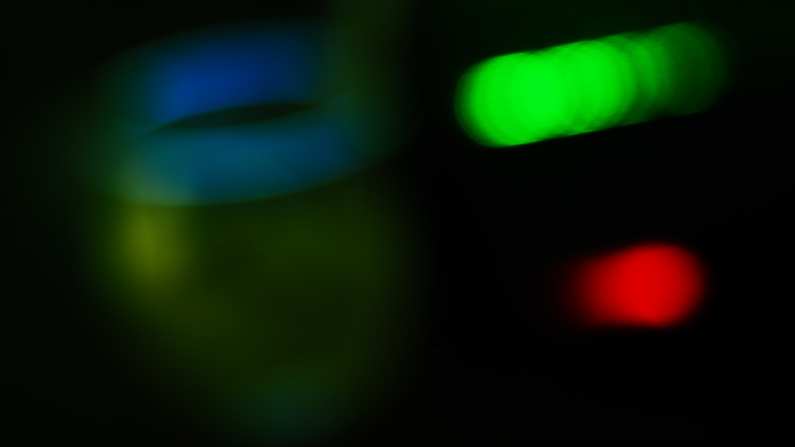
#6: Grainy Film
|
#7: Pin Hole
|

#8: Diorama
|
#9: Cross Process
|
#10: Gentle Sepia
|
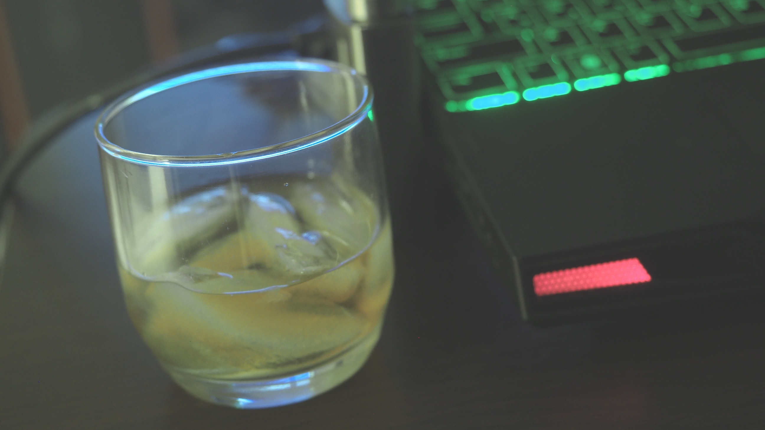
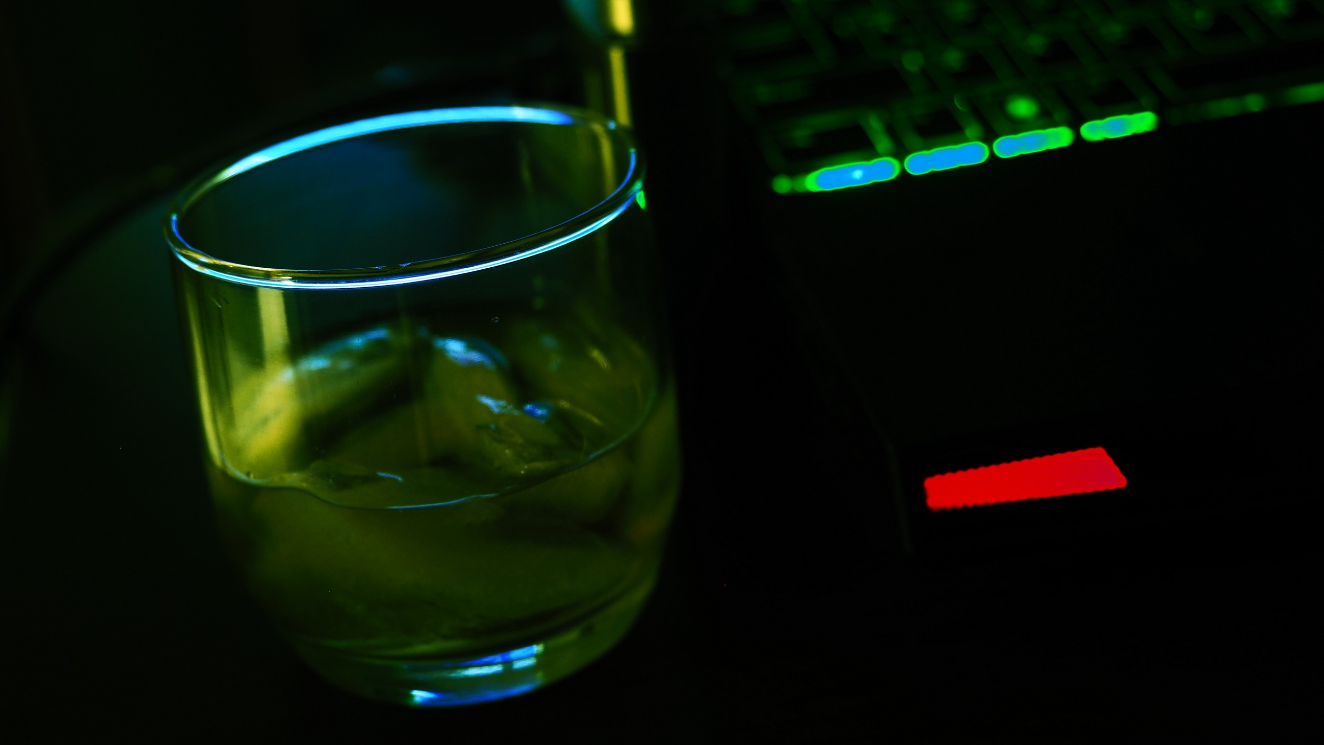
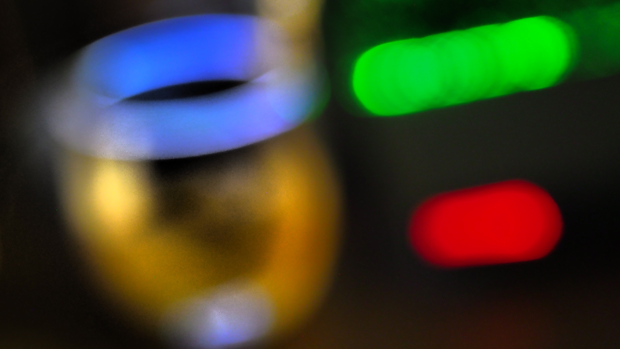
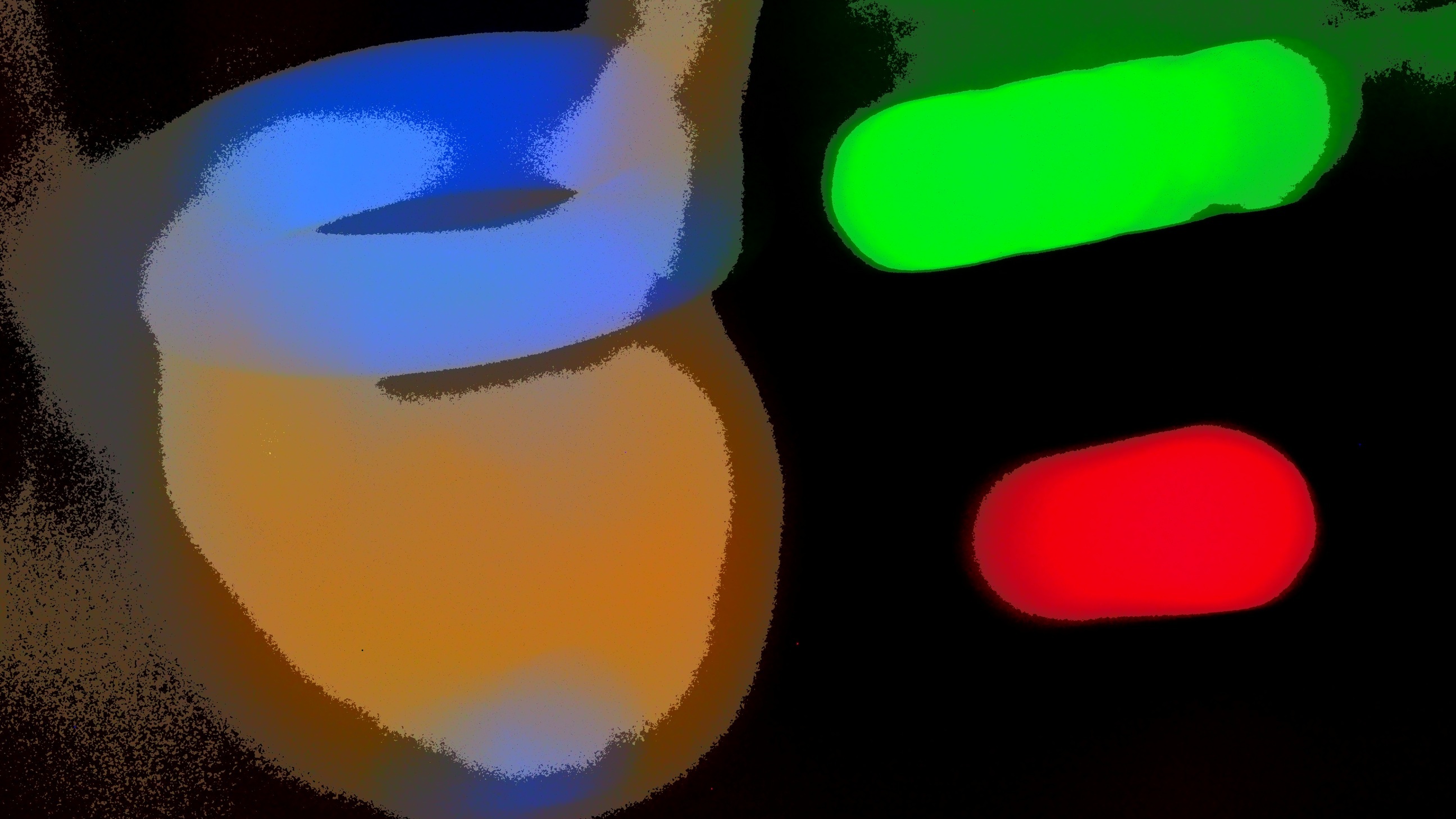
#11: Dramatic Tone
|
#12: Key Line
|
#13: Watercolor
|
#14: Vintage
|
#15: Partial Color
|
|
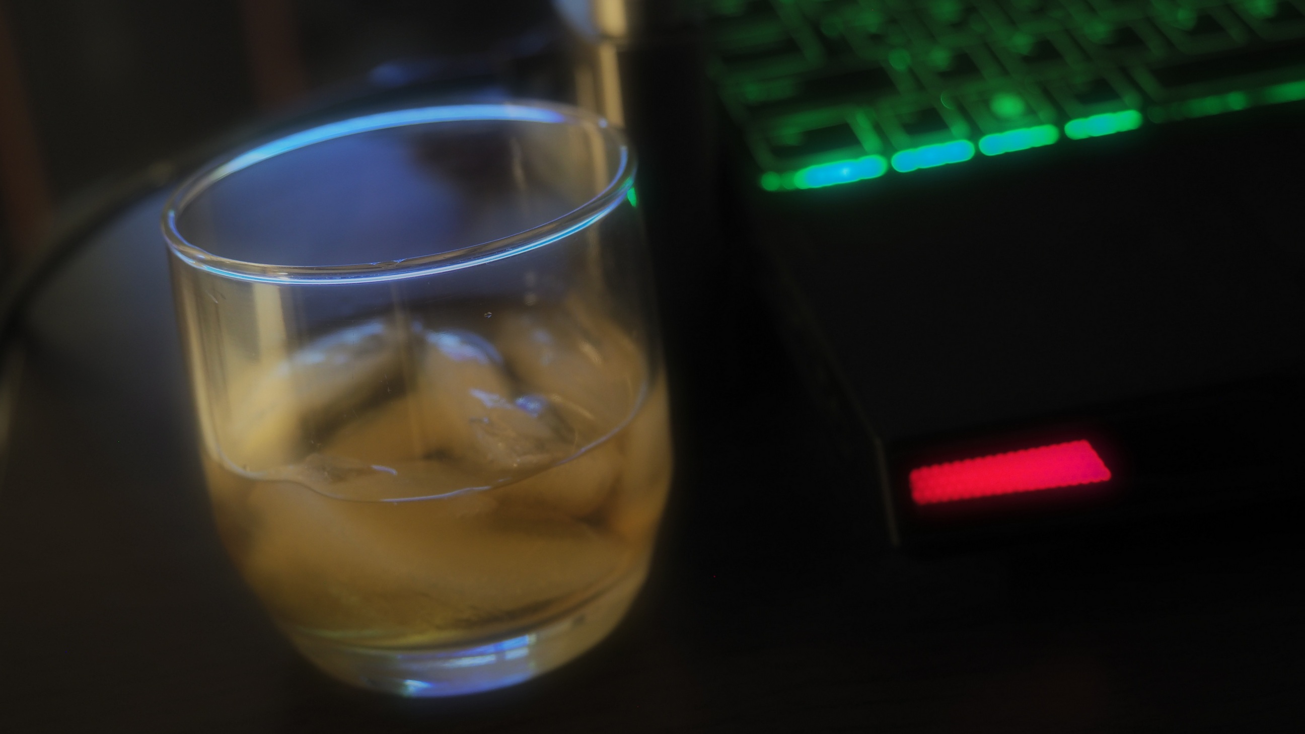
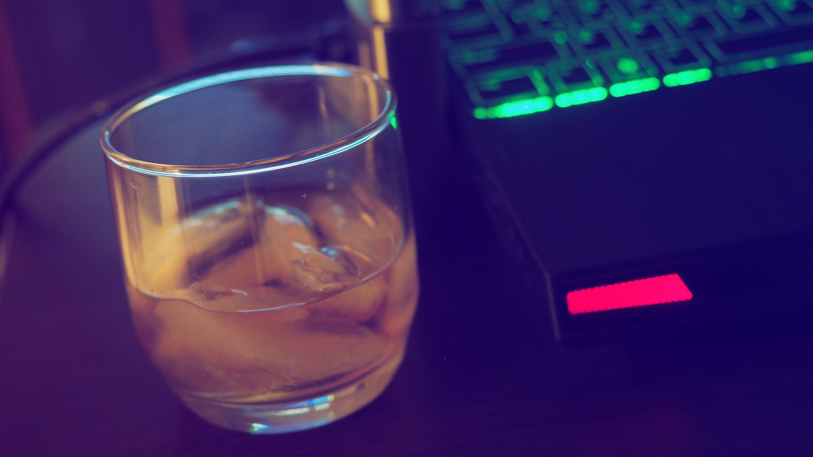
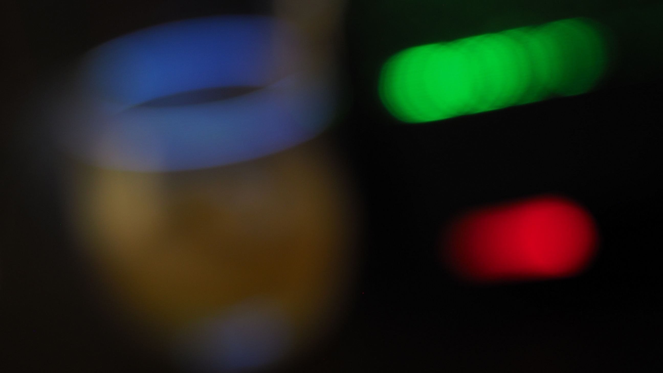
Not so bad. It is a matter of taste, but for me four out of fourteen effects worked quite well on this scene (#2, #6, #8 and #11) — out of the box, automated, with zero effort and no adjustments. There is no tweaking option here at all, although some effects have two or even three versions (distinguished just by numbers). Partial Color allows you to pick the color to keep. That's it, take it or leave it. While applying the filter in-camera provides instant gratification, I prefer to open the raw image file in the Olympus Viewer and use that program to apply the filter, at the same time changing the brightness, contrast, color tint, and other parameters to get the result I like most. The Bourbon Project: Out-Of-Focus Now, the second part of the project: the same scene grossly out of focus. The only change between the previous frame and this one was moving the focus planr towards the camera so that everything in the picture changes into fuzzy bokeh (that's how connoisseurs call it). I don't know about you, but what I see in all pictures (including the first, unaltered one) is Mr. Potatohead wearing a toroidal nimbus, like angels do. Yes, I've seen those ring-shaped bokeh patterns produced by mirror lenses, but this is different: slanted and three-dimensional. Obviously, that's the glass rim, but it is pretty. |
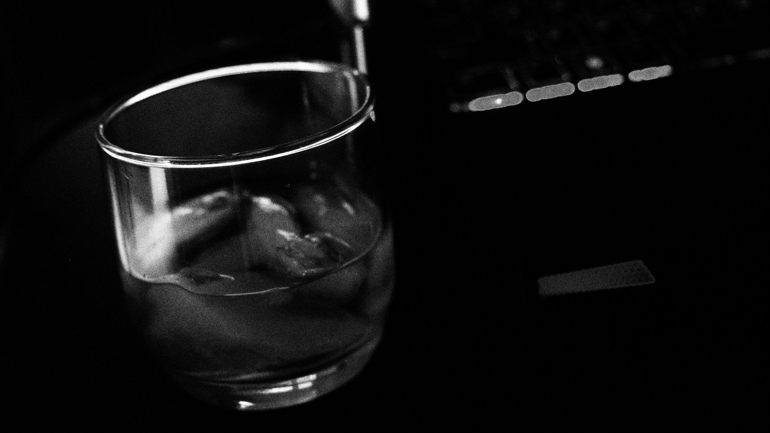
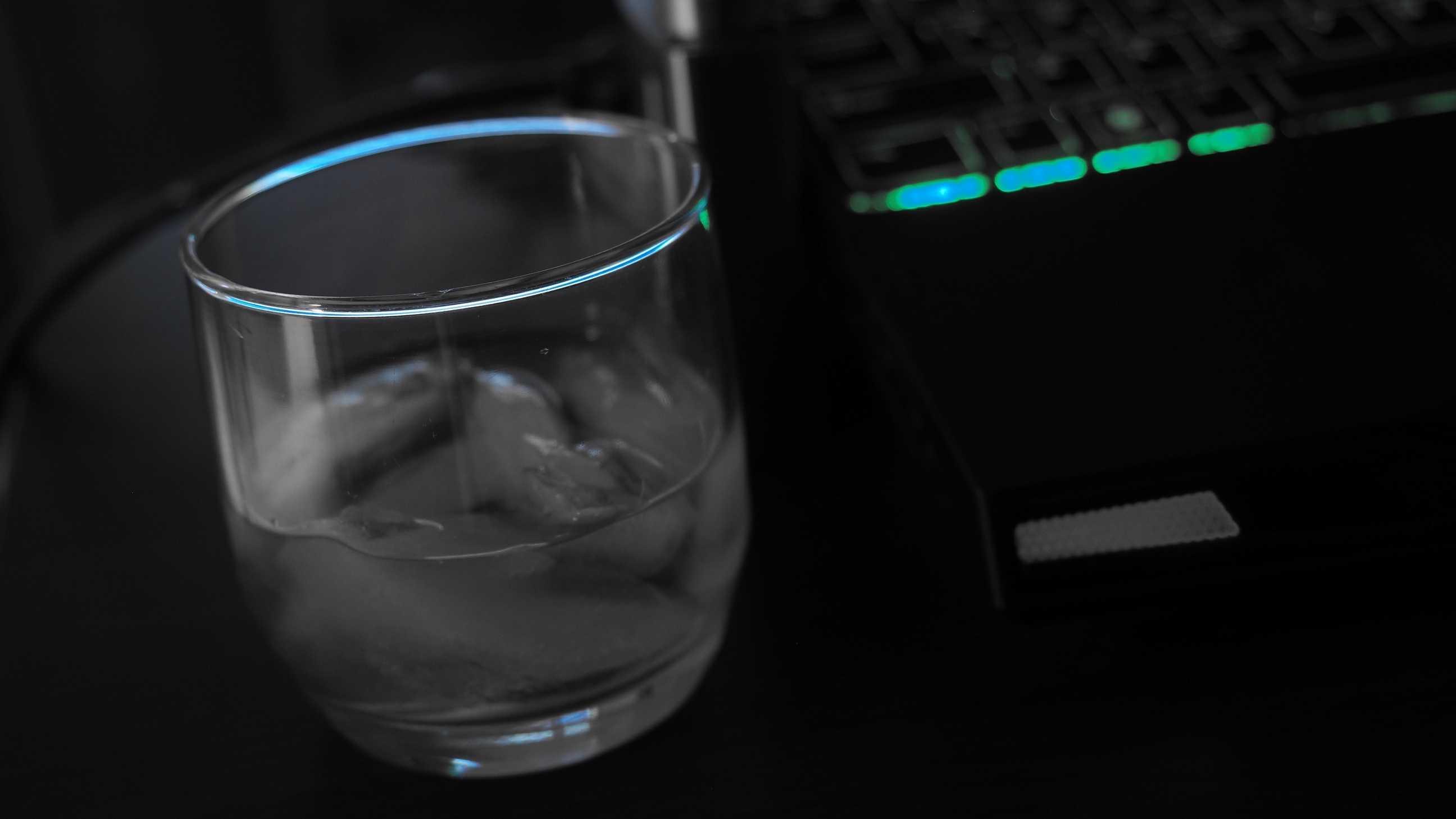
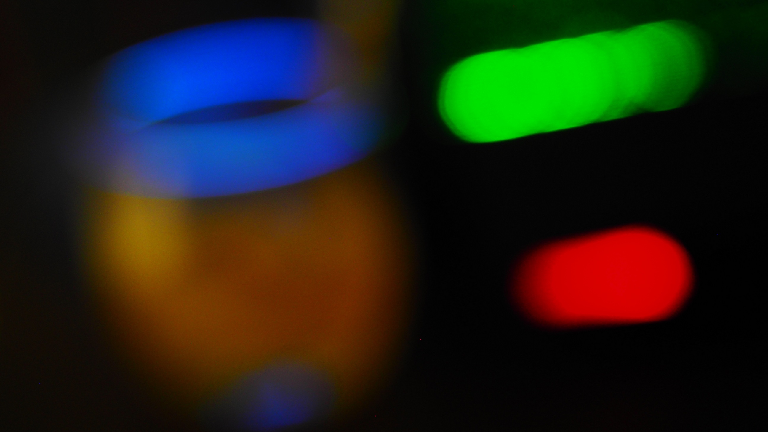
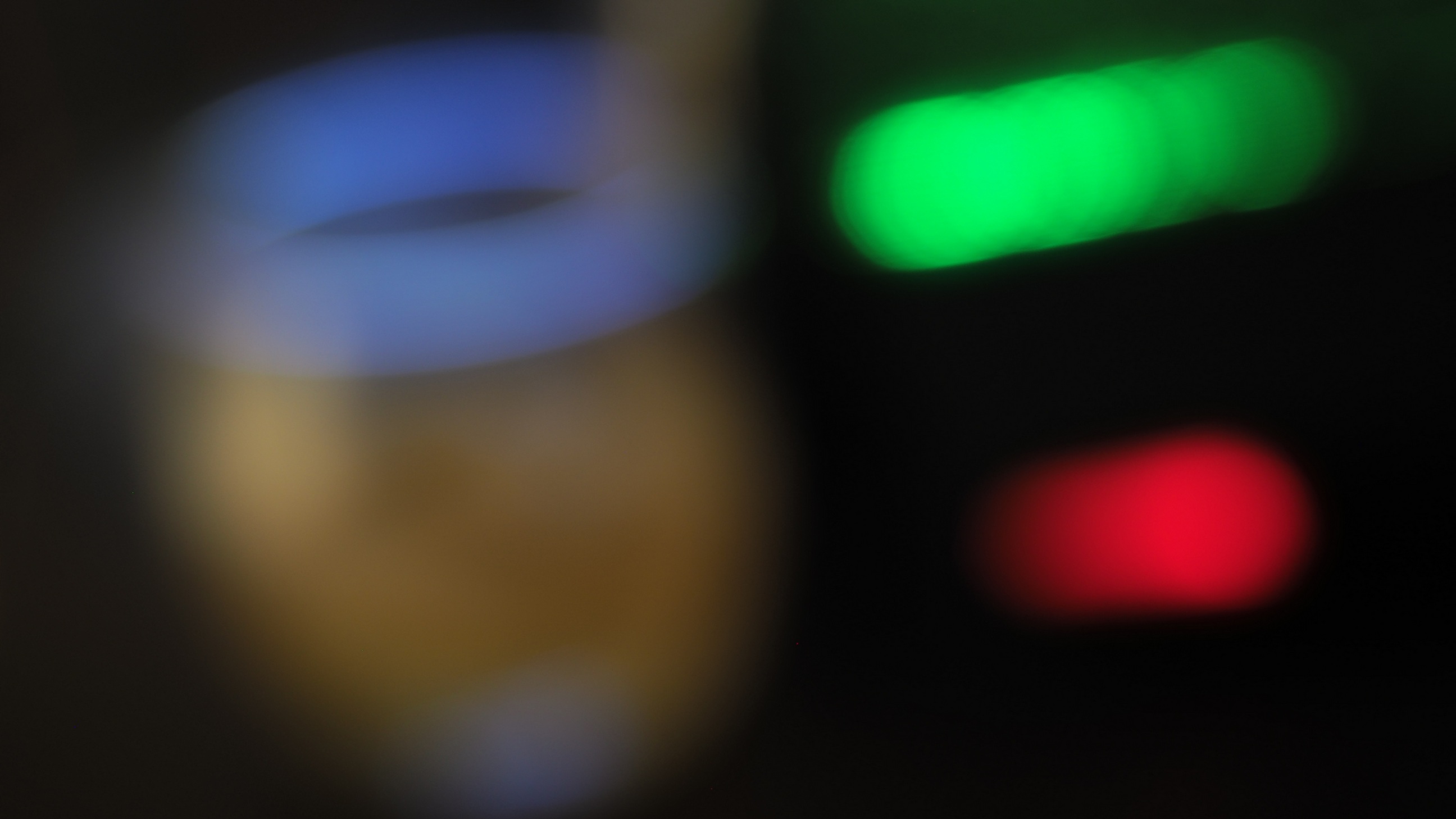
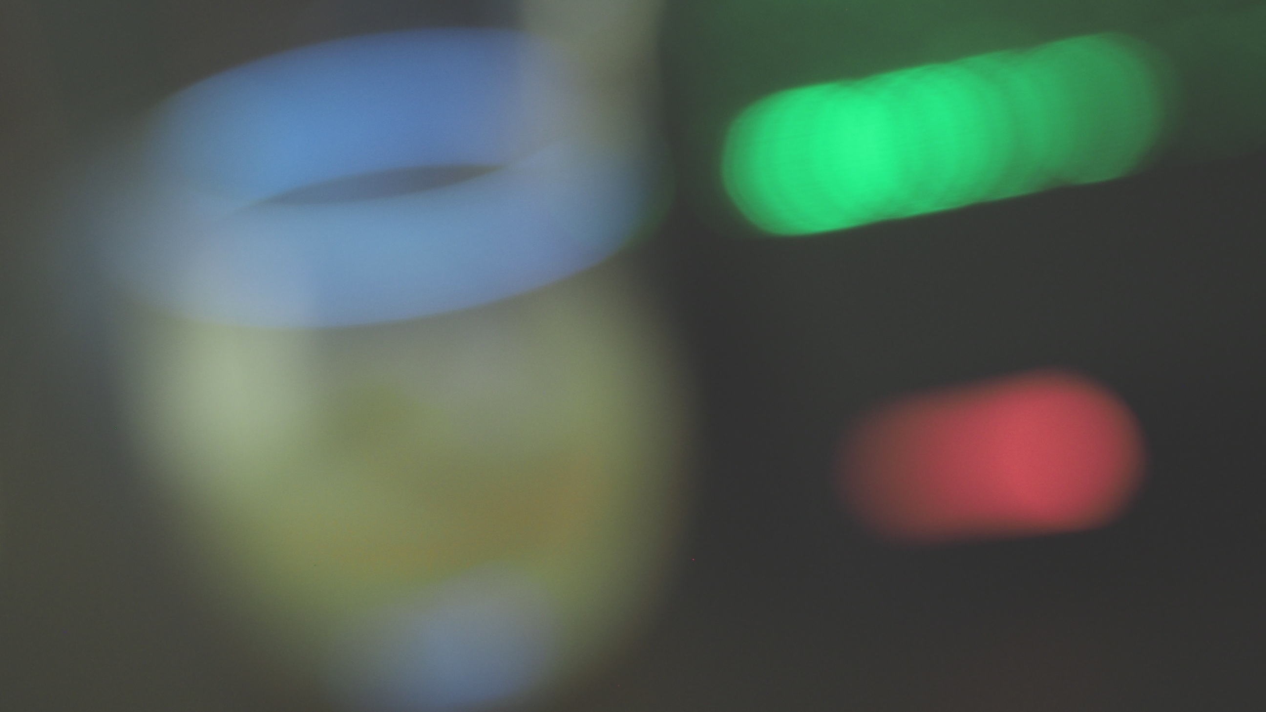
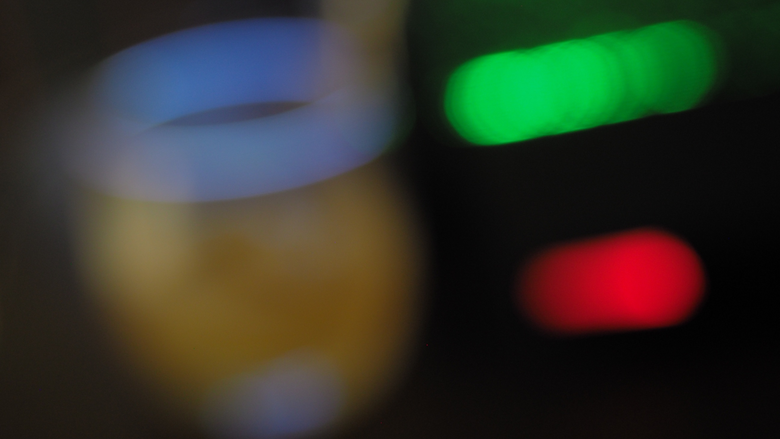
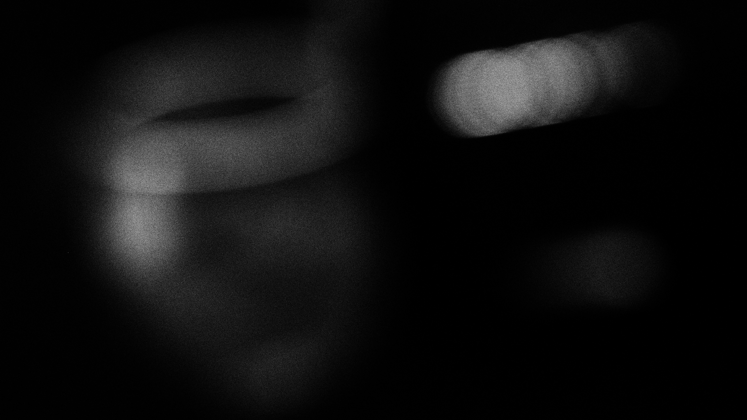
#1: No Effect, Natural Picture Mode
|
This time I won't be commenting on individual results. Too subjective; even my own opinion on a given image changes from day to day.
You may also use the
Flipper
to browse and compare images, without having to return to the thumbnails.
|
#2: Pop Art
|
#3: Soft Focus
|
#4: Pale & Light Color
|
#5: Light Tone
|
#6: Grainy Film
|
#7: Pin Hole
|
#8: Diorama
|
#9: Cross Process
|
#10: Gentle Sepia
|
#11: Dramatic Tone
|
#12: Key Line
|
#13: Watercolor
|
#14: Vintage
|
#15: Partial Color
|
|
While this is very subjective, I consider the results, some of them, nice. Nothing special, but nice. Like elevator music. Actually, I like the in-focus results more, but they won't work as wallpapers on this project. From each frame shot I'm getting two or three keepers. This means that to get the dozen wallpapers I need, I have to arrange and shoot my little scene four to six times. Maybe more: the results are largely random, hard to predict. Were the Olympus Art Filters helpful in getting the desired results? Certainly. But this did not have to be done in-camera, and in the future I will be rather using them in Olympus Viewer. |
|
|
My other articles related to the |
| This page is not sponsored or endorsed by Olympus (or anyone else) and presents solely the views of the author. |
| Home: wrotniak.net | Search this site | Change font size |
| Posted 2017/05/27; last update 2017/12/17 | Copyright © 2017 by J. Andrzej Wrotniak |